Deerns Brand Guidelines
The Deerns Brand Guidelines provide the introduction and details on how to use the new Deerns brand assets including logos, colour palette, typography and imagery. This empowers you to use the Deerns visual identity in a consistent way so that our brand has high impact.

Deerns Logos, Icons and Graphics
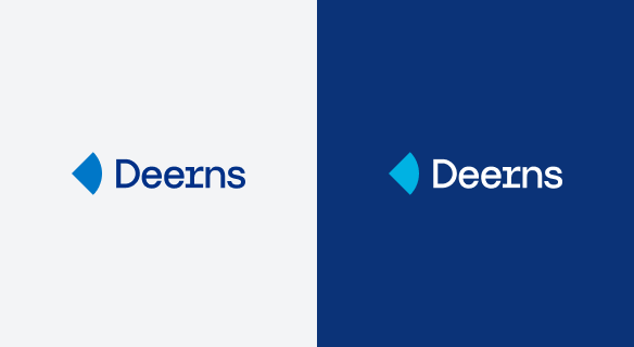
The Deerns icon is derived from the meeting of a perfect circle and a perfect square. It symbolises the combination of the lateral creative spirit and rational system thinking at Deerns. The icon and the Deerns wordmark are a distinctive brand asset and our five logos should be used following the Deerns Brand Guidelines. The five logos should not be modified or manipulated. The main logo is the two colour positive and should only be used against a white or light background.

Template User Guide
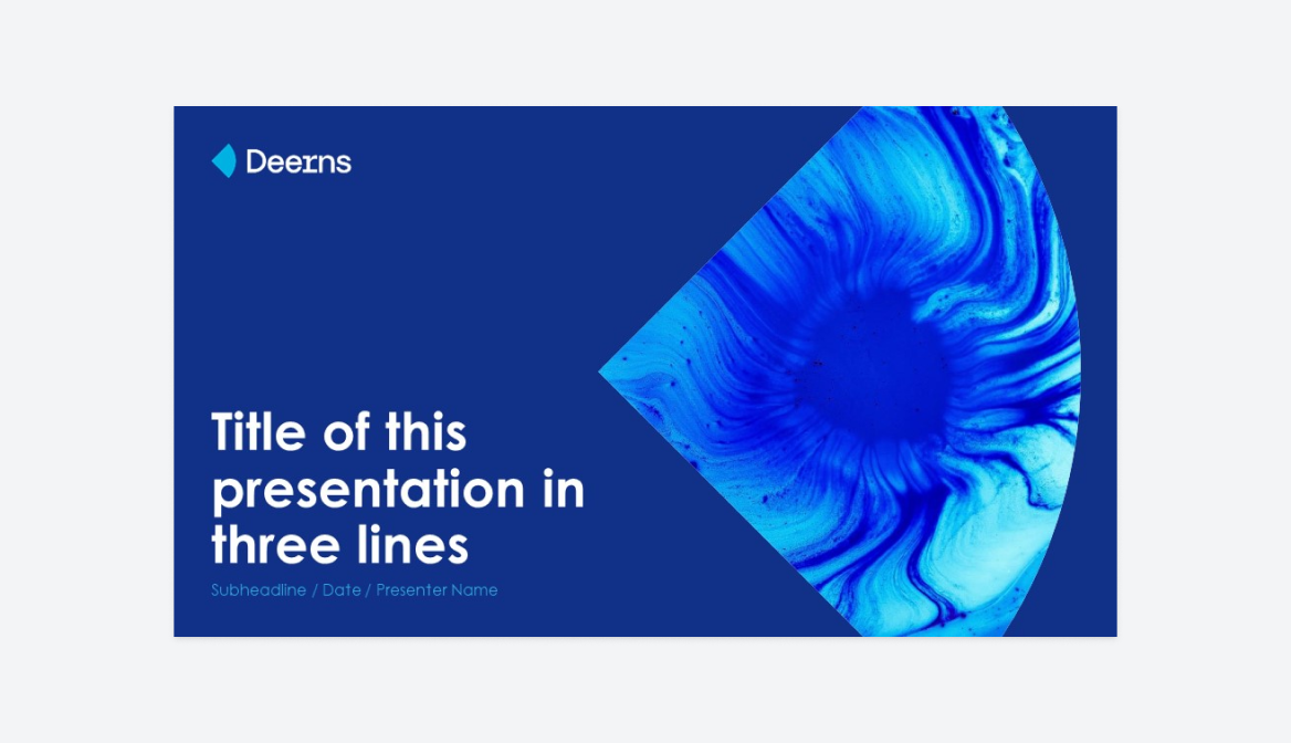
We have several branded business templates for a CV, Project Reference and Power Point Presentations. Branded stationery includes a Report, Letterhead, Memo, and Meeting Minutes. Follow these guidelines on how to activate these templates using Eformity in Microsoft Office applications such as Word, PowerPoint and Excel.

Typography
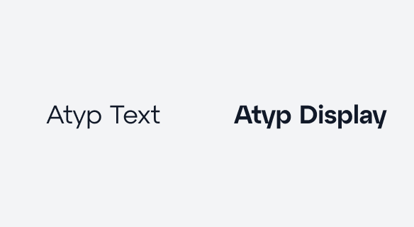
Our primary typeface for Websites is Atyp Text to reflect our daring and confident personality. We use two other typefaces for specific documents:
- Arial in emails, word and excel documents
- Century Gothic Regular in Power Point Presentations
Note: access to the Marketing and Communication Community and Web development teams only.

Sales support library
We would like to everyone in Deerns to have central access to all branded documents needed to submit proposals and make presentations to clients. You are invited to upload the latest Project References, updated commercial CVs here. You can also download/upload Division, Sector or Department PowerPoint presentations here.
